Hopefully you’ve established the social media metrics that matter the most for your business (and if not, we can help you figure out the ones that do).
Now you’re thinking about how to present the results to someone else—your manager, an executive in the company, or a client. In order to sell the value of social media, you need to know how to present the data clearly in order to make a persuasive case.
5 tips for visualizing social media data
Know your graphs
Let’s take you back to STATs 101. All graphs aren’t created equal—each one is designed to display data in a certain way and some are better than others.
Here’s what you need to know about graphs and what they’re used for.
Here’s what you need to know about graphs and what they’re used for.
- Scatter plot—To show correlation.
- Pie chart—To show proportion. Piecuch recommends that you have no more than five slivers. If you need more, you’d be better off using something other than a pie chart.
- Line graph—To show trends and patterns. This is sometimes known as a timeseries graph.
- Bar chart—To show comparisons.
- Table—To show precise values.
Let’s apply this to social media data. A pie chart can display how an ad campaign budget is being spent. Because budgets add up to 100 percent—a definite value—a pie chart will clearly show what percentage of the money is being spent where.
Keep color in mind
“Get it right in black and white,” is one of Piecuch’s go-to quotes when he hosts Hootsuite’s workshop on data visualization. Piecuch actually starts all of his graphs in black and white, then adds color if necessary.
While it’s tempting, using a ton of color to make a data chart more attractive isn’t recommended. Too many colors in a graph can be distracting and unnecessary for your audience to understand the information being presented to them.
Here are some smart ways to incorporate color into data visualization.
- Avoid red—Red has a negative connotation to it. For example, even if you’re highlighting something good—like a rise in Instagram engagement—when our minds see red, we initially think that something went wrong.
- Use color gradients to display a time series—Taking a shade from lightest to darkest can signify past to present. As the color fades, it can illustrate how data from previous years might become less relevant.
- Highlight—A strong hue can emphasize a particular value that you want your audience to pay attention to, such as a surge or drop in click-throughs.
- Give each color a value—This is handy for when you want to use color to represent a range. For example, blue for anything over 90 percent and orange for anything below 10 percent.
- Use color to group relevant data together—For example, you might use blue for Twitter, yellow for Facebook, and pink for Instagram.
- Use company colors—This will ensure you don’t go overboard with too much color.
Know your audience
Just like when it comes to delivering social media content, knowing your audience is key if you want to effectively engage them. Tailor your presentation to the people you’re presenting to, whether they’re stakeholders, colleagues, or executives.
According to Piecuch, the C-suite often prefers a high-level overview of key performance indicators (KPIs). And it makes sense why—executives are busy. Don’t overload them with information.
This report will differ from one created for a director who would likely be interested in both the high-level KPIs and the specific figures that drove them.
In this case, you want a visual that compares values that are very precise. Piecuch recommends tables for this kind of data, especially when you need to show decimal points. They might not be as aesthetically-pleasing as an infographic—but what they do offer is hard data on metrics such as leads, conversions, and more.
Make it easy to understand
Looking at data isn’t like using an app or navigating a website, but the user-experience is just as important. To deliver data insights effectively, Piecuch insists on taking an audience-centric approach when it comes to data presentations.
Here are a few things to keep in mind when considering the user-experience.
- The mind works left to right—This is specific to charts that are meant to compare values. Make sure the values are presented in an ascending or descending order—you don’t want the user to have to go back and forth between values just to compare them.
- Do the work for your audience—That means taking the time to sort data in sequential order, group values together when it makes sense to, and highlight important points.
- Don’t be overly focused on aesthetics—Resist the urge to use too many colors. Refrain from using a pie chart when simply writing out numbers will do.
- Keep it simple—Stay away from clipart, imagery, and logos that will clutter your presentation. Let the data speak for itself.
Use the right tools
We asked Piecuch as well as Hootsuite production designer Brenda Wisniowski what kind of tools are best for presenting data. Here are some of their favorites:
- Tableau—Tableau makes it easy to take an enormous amount of information and turn it into a dynamic visual. They’ve catered to industries of all kinds and businesses of different sizes. There’s also a free version available online.
- Adobe Illustrator—This is great for the designer on your team, as they’re probably using Illustrator in their role already. With that mind, getting the most out of Illustrator’s graph-making feature will come easy. The program offers nine customizable graphs to suit your needs.
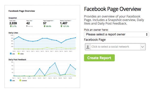
- Hootsuite Analytics—You saw this one coming. When reporting for business, the Hootsuite dashboard takes your social media metrics and turns them into shareable visuals.
- Boards are good for live data—things like campaign management or social media listening. Reports are customizable documents, which makes them great for KPIs, campaign effectiveness, or competitive intelligence.
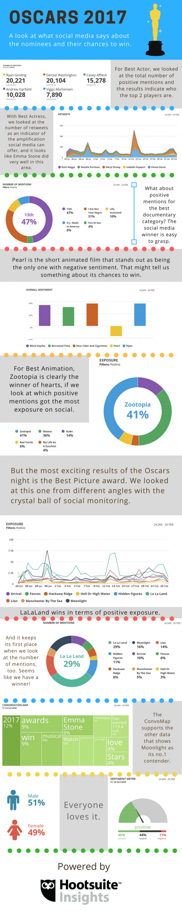
Here’s a Hootsuite Analytics report that visualizes our data team’s predictions for the 2017 Oscar.
And if all else fails, we’ll leave you with this handy quote from Hootsuite’s data expert: “Stick with the tools you are comfortable with,” says Piecuch. “But if it’s Excel, stay away from the defaults.”
No comments:
Post a Comment